
QA Subject Reports#
QA Subject reports shows the full quality profile of one subject across runs and tasks. Useful to isolated quality assessments.
Report Overview
This section explains report structure and interpretation. For run commands and GUI clicks, use the Tutorial.
Overview tab (what to inspect first)#
Subject summary It includes basic metadata, such as the name of the dataset, subject ID, number of runs and the number of metrics computed by MEGqc.
Run × metric availability table Confirms which metrics were computed for each run/task.
Recording header information Metadata from the original raw files, divided by run/task. This includes some general information (such as acquisition date and experimenter), as well as channel information (such as good, bad channels, ECG/EOG channel name) and recording properties (such as sampling frequency and hardware filters).
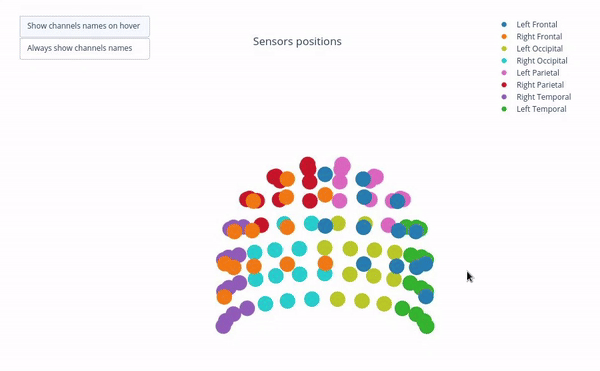
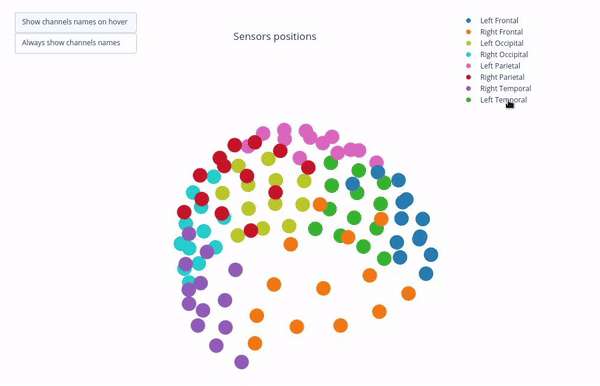
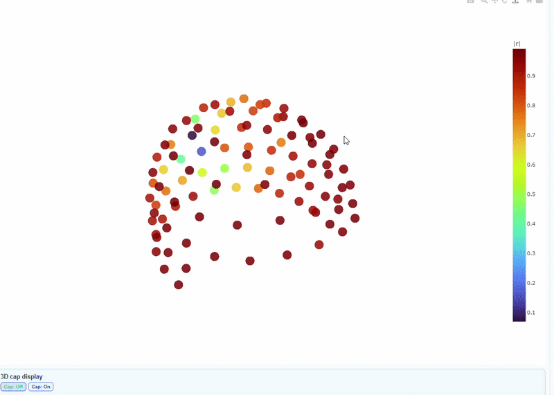
Sensor positions (3D, one panel per run)#
Visual representation of MEG sensor geometry on the head model.
Sensors are color-coded by lobe grouping. The same color convention is reused across multiple plots.
There are head models for every task/run.
You can also see the
tsvsource file paths for these plots by clicking on “Sources”.
You can interact with the 3D scene to explore sensor locations and their lobe groupings:
Click-and-drag to rotate the head model. You can also zoom in and out using the scroll wheel.
Click legend items to toggle lobe groups (e.g., click “Left Frontal” to hide/show frontal sensors).
Sensor labels
Magnetometers names end with ‘1’ like ‘MEG0111’.
Gradiometers names end with ‘2’ and ‘3’ like ‘MEG0112’, ‘MEG0113’.
Across the visualizations of the different metrics, you can interact with the figures in many way:
Topoplots (3D): when available, use
Cap: ONto add a solid cap representation of the head, which can help to contextualize sensor locations and their variability patterns.Color-coded lobe plots: click a legend item once to hide/show that lobe group, or double-click to isolate one lobe group.
Metric tabs#
Metric tabs
Every scope section contains an explication of the same metrics. The exact visualizations and interpretations may differ, but the general structure is consistent. Use the right side menu to navigate to the metric of interest.
Each metric tab follows this pattern:
run/task subtabs (e.g., deduction and induction)
channel-type subtabs (
MAG,GRAD, optionallyGeneral),plot subtabs for that metric (e.g., Channel-wise STD topomap (3D)).
Standard Deviation (STD) tab#
This metric shows different views on channel variability, which allows you to identify noisy and flat channels and temporal non-stationarities.
1) Channel-wise STD topomap (3D)#
This plot shows the spatial distribution of channel variability across the head. Sensors are color-coded by their STD values (with a colorbar indicating the range). This allows you to quickly identify hot areas of sensor burden or isolated islands. You can interact with the 3D scene as in the Overview tab: You can rotate the head to see sensors from different angles, by clicking and dragging the mouse. You can also zoom in and out using the scroll wheel. Names and STD values appear on hover.
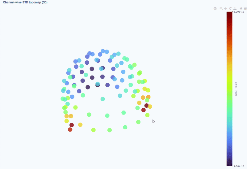
You can also use the menu below to add a solid cap representation of the head, which can help to contextualize sensor locations and their variability patterns.

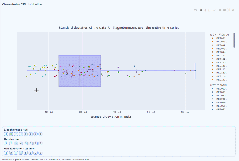
2) Channel-wise STD distribution#
This plot shows the distribution of STD values across channels. The shape of the distribution can reveal whether variability is widespread or concentrated in a few channels.
Every dot represents one channel, you can see the name and STD value on hover (e.g., MEG0211: 4.37e-13). The x-axis shows you the range of STD values in Tesla, extreme left-values (close to zero) indicate flat channels, while extreme right-values indicate highly variable channels. The position on the Y-axis do not hold information. The channels dot are color-coded by lobe group.
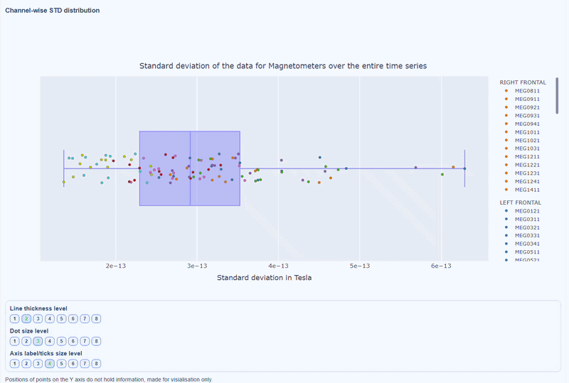
As with other plots, you can click on the legend items to hide/show lobe groups, which can help to identify whether variability is concentrated in specific brain regions. If you double-click on a legend item, you can isolate one lobe group, which can help to focus on specific regions of interest.
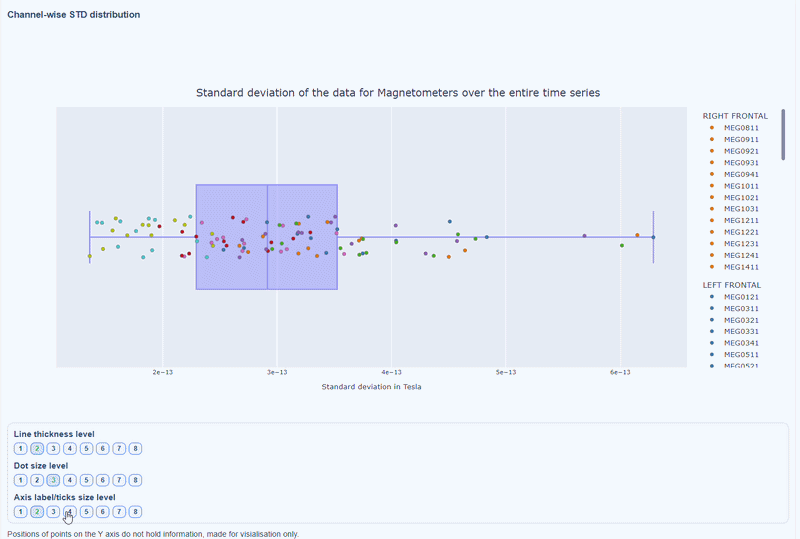
You can also use the menu below to increase the thickness of the boxplot, the size of the dot and the textsize of the axis labels, to make it easier to read.
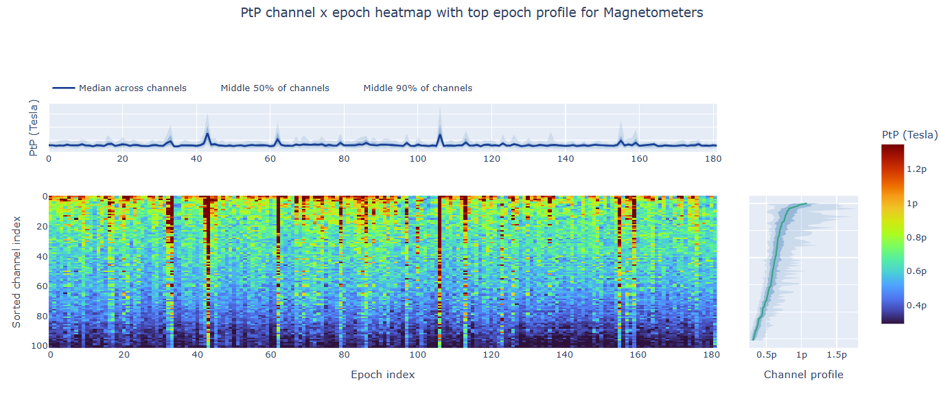
3) Channel × epoch heatmap#
This plot shows the STD values for each channel (y-axis) across epochs (x-axis).
The color of each cell indicates the STD value for that channel in that epoch, with a colorbar showing the range. This allows you to identify temporal patterns of variability, such as transient bursts (vertical bands) or persistent channel issues (horizontal bands).
The top profile shows the average STD across channels for each epoch, which can reveal epochs with overall high variability. The right profile shows the average STD across epochs for each channel, which can highlight channels with consistently high variability.
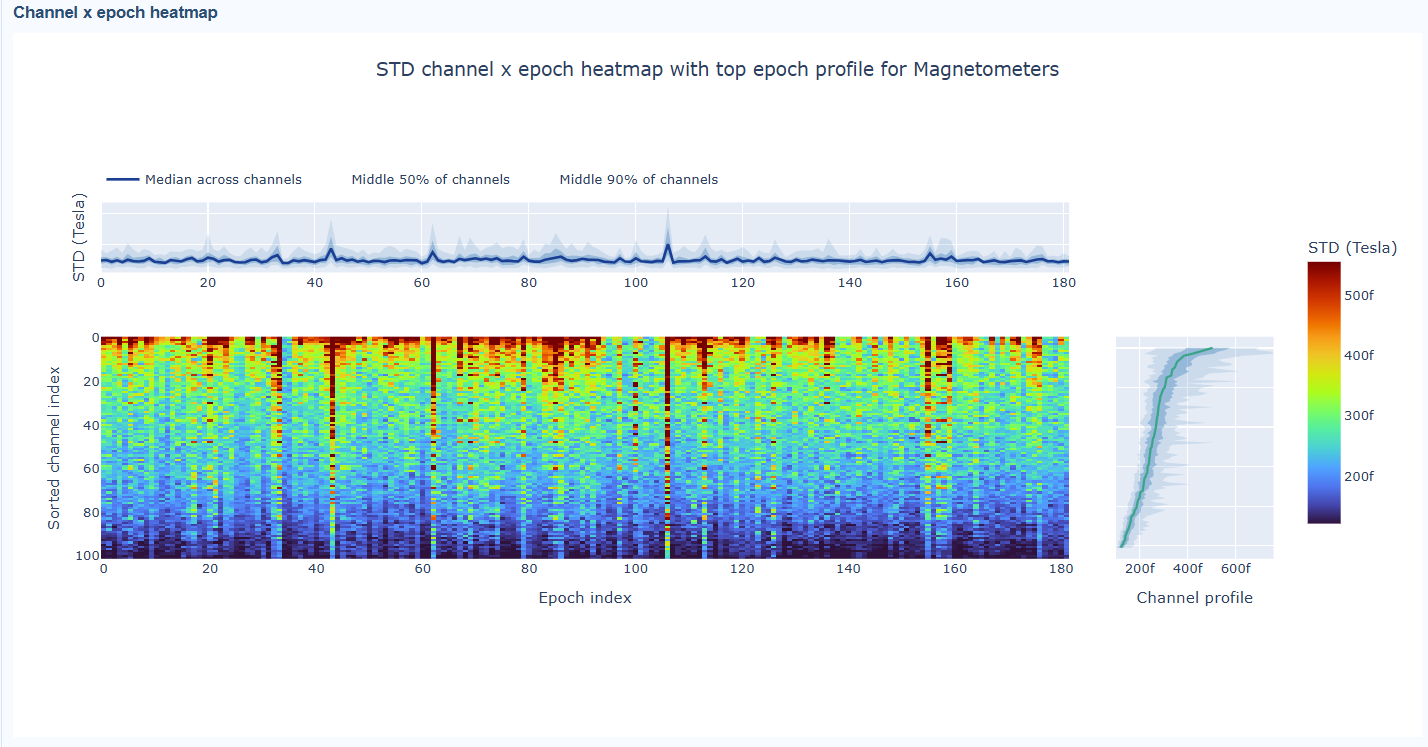
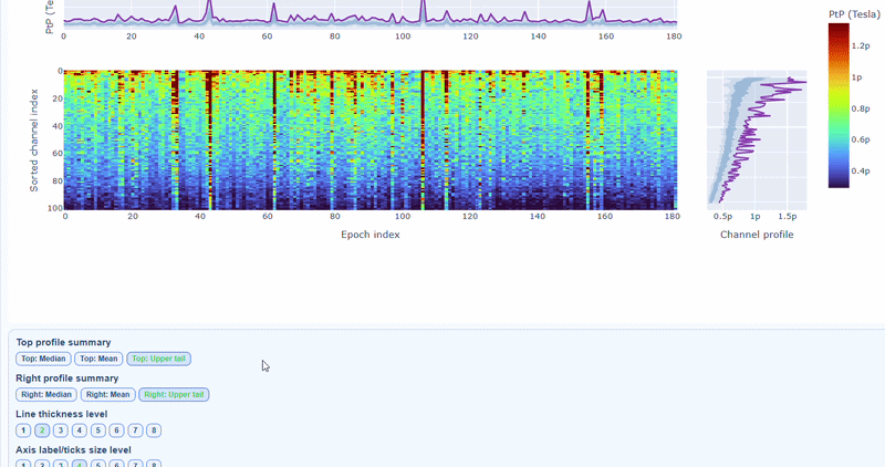
You can also use the menu below to choose between plotting the median, the mean or the upper tail (75th percentile) in the top profile, to better capture different types of epoch-level or channel-level burden.
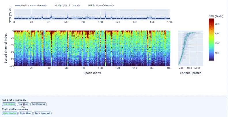
You can also use the menu below to increase the line thickness and text size of the heatmap and profiles, to make it easier to read.
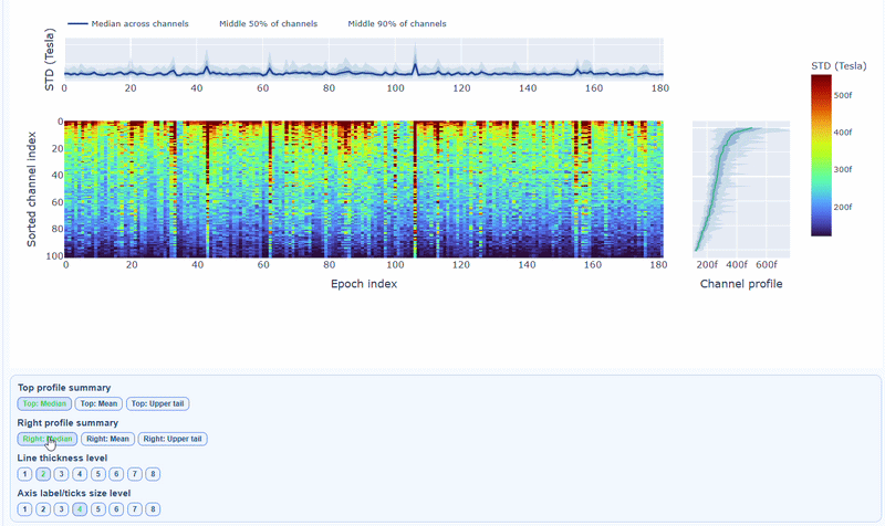
Channels repeatedly high in the right profile are candidates for bad-channel labeling, while isolated epoch spikes in the top profile suggest selective epoch rejection. Mixed patterns should be cross-checked with PtP and PSD before hard exclusion.
Peak-to-Peak (PtP) tab#
This metric shows different excursion amplitude views, to locate transient bursts and outlier excursions. It is calculated as the difference between the maximum and minimum signal values within an epoch for each channel, max(signal) - min(signal). The visualizations in the PtP tab are similar to those in the STD tab, but they focus on excursion amplitudes rather than variability.
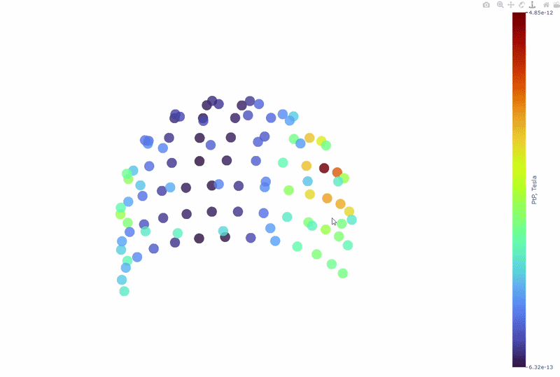
1) Channel-wise PtP topomap (3D)#
Each dot represents a sensor, and its color indicates the PtP value, the colorbar shows the range of PtP values in Tesla. This allows you to identify sensors with high excursion amplitudes, which may indicate transient artifacts or outlier events.
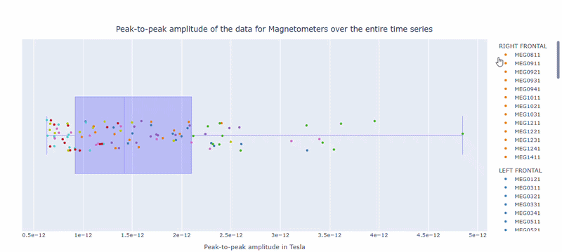
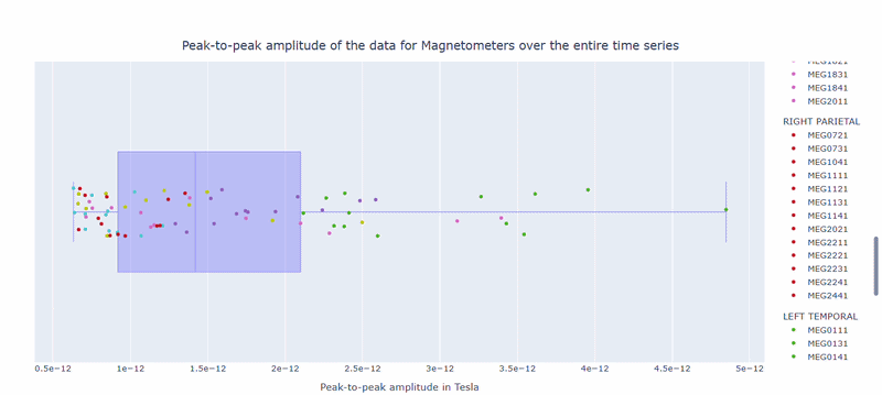
2) Channel-wise PtP distribution#
The boxplot shows the distribution of PtP values across channels. Each dot represents a channel, and its color indicates the lobe group. The x-axis shows the range of PtP values in Tesla, with extreme right-values indicating channels with high excursion amplitudes. The position on the Y-axis does not hold information. On hover, you can see the channel name and PtP value (e.g., MEG0211: 4.37e-13).
3) Channel × epoch heatmap#
This plot shows the PtP values for each channel across epochs, with the color of each cell indicating the PtP value for that channel in that epoch, and a colorbar showing the range. This allows you to identify temporal patterns of high excursion amplitudes, such as transient bursts (vertical bands) or persistent channel issues (horizontal bands).
The top profile shows the average PtP across channels for each epoch, which can reveal epochs with overall high excursion amplitudes. The right profile shows the average PtP across epochs for each channel, which can highlight channels with consistently high excursion amplitudes. You can choose (with the menu below) to plot the median, the mean or the upper tail (75th percentile), to better capture different types of epoch-level or channel-level burden.
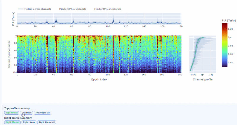
You can also use the menu below to increase the line thickness and text size of the heatmap and profiles, to make it easier to read.
Persistently high PtP values are bad-channel candidates, sparse high-PtP epochs can be rejected selectively. Mixed patterns should be cross-checked with STD and PSD before hard exclusion.
PtP (auto) and PtP (manual) subtabs#
The PtP (auto) subtab shows the PtP values calculated using the MNE-based automatic epoching method, while the PtP (manual) values are calculated using MEGqc internal PtP pathway and thresholds.
Power Spectral Density (PSD) tab#
Power spectral density (PSD) characterize frequency-domain burden and are used to detect narrowband interference (for example mains harmonics) and broad-band contamination. The same spectral analysis applies to both MAG and GRAD channels. Common interference sources (power line harmonics, environmental noise) typically affect both channel types similarly.
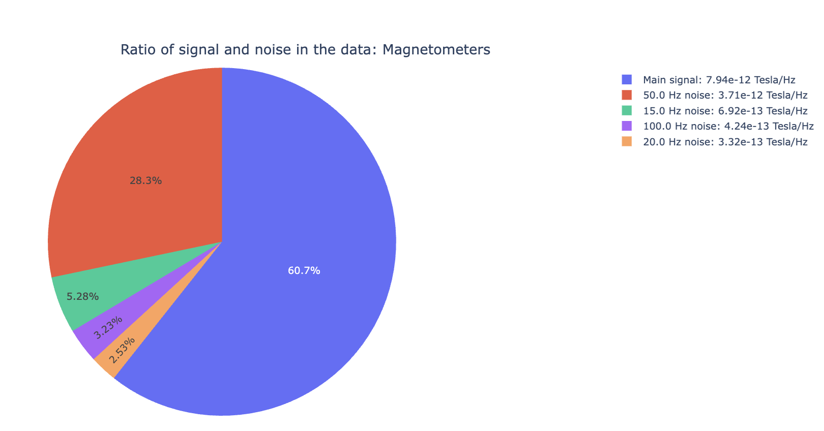
1) Signal-to-noise ratio (SNR) all channels#
Useful for quick triage before detailed spectrum inspection. High noise indicates a strong narrowband contamination burden. For example, line noise at 50Hz and its harmonics (100Hz, 150Hz).
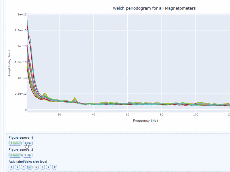
2) PSD curves by channel#
It shows the Welch PSD curves for all channels. high global noisy-frequency count suggests global filtering/interference. Always interpret with task context and raw spectra.
Every channel line is color coded by lobe group. You can also click and drag to zoom in on specific frequency ranges.
On hover you can see the channel name and the PSD value at that frequency (e.g., MEG0211: 1.2e-13 at 50Hz). This allows you to identify channels with high power in specific frequency bands.
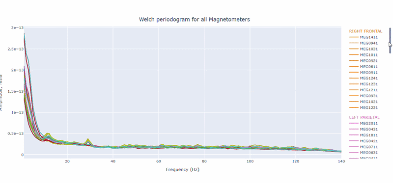
You can choose wether to plot in linear values or in logarithmic (dB) scale, which can help to better visualize differences in power across channels and frequencies.
You can as well increase the text size of the axis labels and the legend, to make it easier to read.
Narrow tall peaks indicate fixed frequencies contamination and broad elevation across suggests movement-related effects. Channel-specific peaks suggest localized hardware issues.
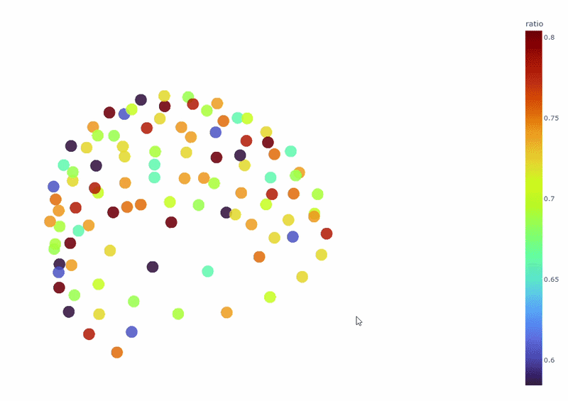
3) Channel-wise PSD topomap (3D)#
It reveals the spatial concetration of spectral contamination. You can rotate the figure and hover over sensors to see their names and PSD values at specific frequencies.
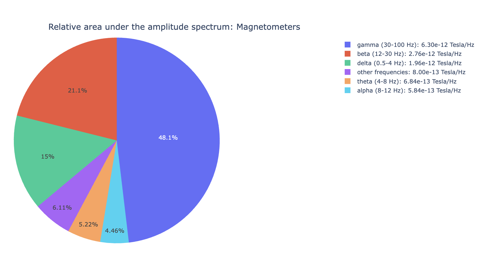
4) PSD Relative band amplitude all channels#
This plot shows the relative amplitude of specific frequency bands (e.g., alpha, beta) contributions in all channels. It reveals dominant frequency content profile.
Electrocardiogram (ECG) tab#
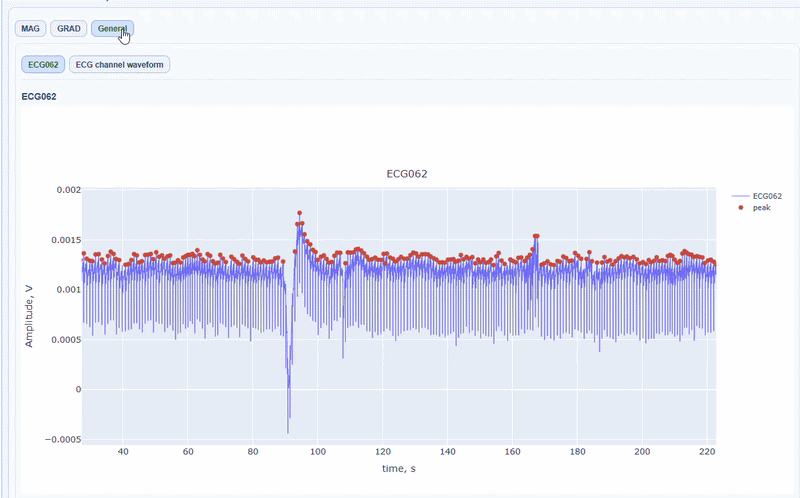
First, MEGqc will display some basic notes, such as the name of the ECG channel, and the overall quality, including whether peaks have similar amplitudes, if there were any breaks (too long distance between peaks), the presence of bursts (too short distance between peaks) and whether if it shows the expected ECG pattern. It also gives you the total number of ECG detected (peaks) and the average heart beats per minute.
Apart from the MAG and GRAD sub-tabs, there is a General sub-tab that contains visualizations of the ECG signal itself, which can be useful to check the quality of the ECG signal and the accuracy of the peak detection.
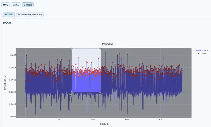
General sub-tab#
In this tab, you can find general visualizations of the ECG channel, such as the raw signal over time (in blue) and the detected peaks(red dots). You can zoom-in on specific time segments to check the quality of the ECG signal and the accuracy of the peak detection. On-hover you can see the time and amplitude. You can also increase the size of the line and the dots.
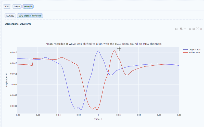
You can also see the average waveform around the peaks, and a shifted version of the same waveform aligned with the MEG channels.
MAG & GRAD sub-tabs#
In this sub-tabs you can see how the ECG artifacts affects0 the MEG sensors.
Channel-wise ECG topomap (3D): This plot shows the spatial distribution of ECG artifacts across the head. Sensors are color-coded by their average ECG artifact amplitude. This allows you to quickly identify hot areas of cardiac contamination. As in other topomaps, you can use the
cap onfunction and you can hover over sensors to see their name and ECG artifact amplitude.
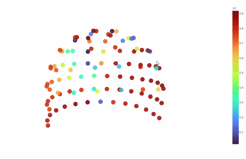
Correlation-magnitude channels: There are three plots showing the correlation between the ECG signal and the MEG channels, sorted by magnitude (highest, middle and lowest). This can help you to identify which channels are most affected by cardiac artifacts.
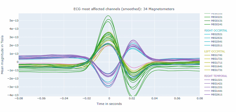
As in other plots, the signals are color-coded by lobe and you can de-select specific lobes or isolate them by clicking on the legend. You can also zoom-in on specific time segments, increase the line thickness and the text size of the axis labels, to make it easier to read.
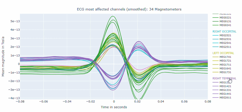
A high percentage of affected channels indicates a stronger need for cardiac-artifact handling. Task-specific shifts can reflect condition-dependent sensitivity to contamination. If reference signal quality is poor, interpret the estimated ECG burden with caution. ECG contamination patterns tend to be similar across MAG and GRAD sensors, though their spatial distribution may vary slightly. The QC summary provides compact, run-level metrics to support quick assessment across datasets.
Electrooculography (EOG) tab#
Similar to the ECG tab, MEGqc will display some basic notes about the EOG channel, such as the name of the EOG channel, whether if it shows the expected EOG shape, number of EOG events detected and blink rate per minute.
Alongside the MAG and GRAD sub-tabs, in the General sub-tab you can find visualizations of the EOG signal itself.
General sub-tab#
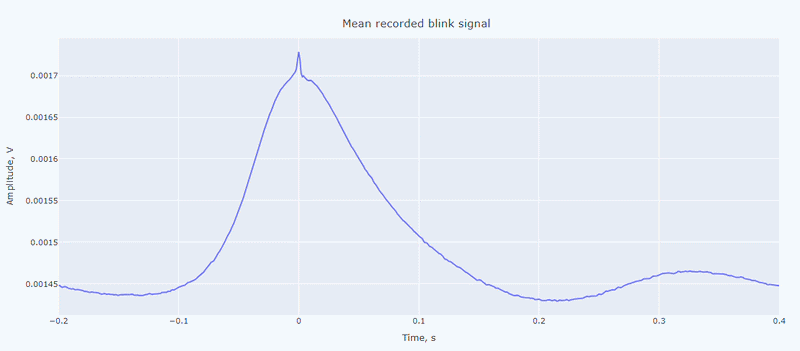
It contain a general visualization of the EOG signal itself (blue) and the detected peaks (red dots). You can also see the average recorded blink signal.
MAG & GRAD sub-tabs#
These sub-tabs show how the EOG artifacts affects each type of MEG sensors.
Channel-wise EOG topomap (3D): This plot shows the spatial distribution of EOG artifacts across the head. Sensors are color-coded by their average EOG artifact amplitude. This allows you to quickly identify hot areas of ocular contamination. As in other topomaps, you can use the
cap onfunction and you can hover over sensors to see their name and EOG artifact amplitude.
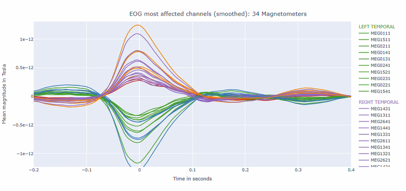
Correlation-magnitude channels: There are three plots showing the correlation between the EOG signal and the MEG channels, sorted by magnitude (highest, middle and lowest). This can help you to identify which channels are most affected by ocular artifacts.
EOG contamination typically produces its strongest effects in frontal sensors. Broad high coupling values suggest a strong blink/ocular burden. Although anteriorly concentrated topographic maps are expected for EOG artifacts, it is still important to quantify the burden to support consistent thresholding. Always interpret EOG load together with task timing and behavioral context before making exclusion decisions.
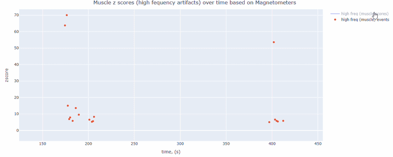
Muscle tab#
This metric shows high frequency artifacts in range between 110-140 Hz. High power in this frequency band compared to the rest of the signal is strongly correlated with muscles artifacts, as suggested by MNE. However, high frequency oscillations may also occur in this range for reasons other than muscle activity (for example, in an empty room recording).
For this data file artifact detection was performed on magnetometers, they are more sensitive to muscle activity than gradiometers.
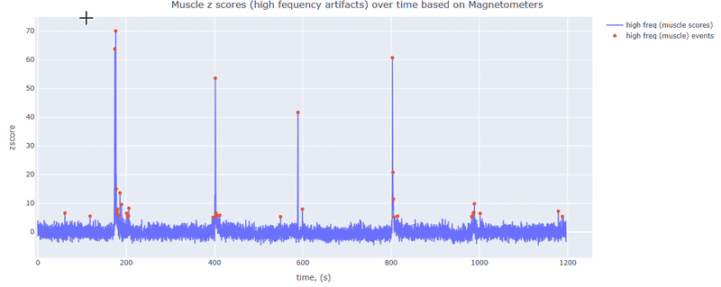
As with other figures, you can modify the size of the line and the text size of the axis labels, or hide and show different components.
Head tab#
Head metric summarizes movement behavior using continuous head position indicator (cHPI) information when available.
cHPI required
If cHPI traces are unavailable, Head outputs are not generated.
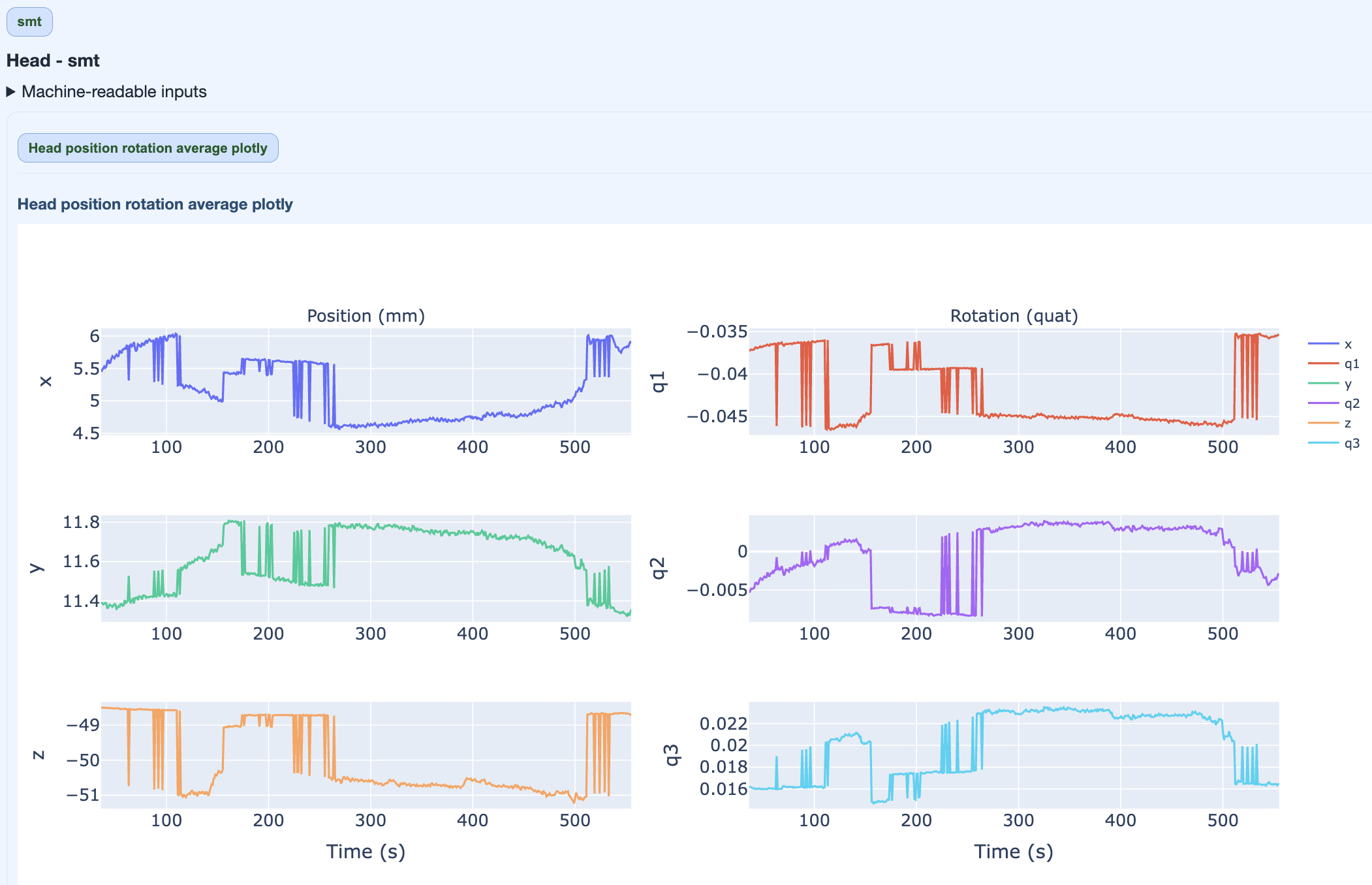
This figure quantifies overall movement magnitude across the recording in every direction (x, q1, y, q2, z, q3). It helps you identify segments with exessive movement. High movement can degrade data quality and may require exclusion or correction.
Stimulus tab#
MEGqc can also read the stimulus events from the raw files and provide some basic visualizations to check their quality. This is important because stimulus events are often used for epoching and analysis, and their quality can affect the results.
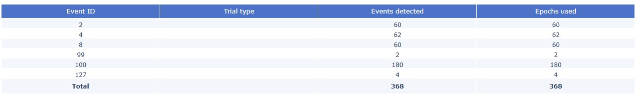
Stimulus Epoch summary table: MEGqc will first try to read the events from the BIDS
_events.tsvfiles, which are obtained from the onset within the task. They are usually more accurate and complete than the events obtained from the stim channel, which are based on hardware triggers. This table shows how many of the events detected were used for the epochs calculation.
If the BIDS events files are not available, MEGqc will fall back to reading the events from the raw files. If there is not a trial type, that column will remain empty.
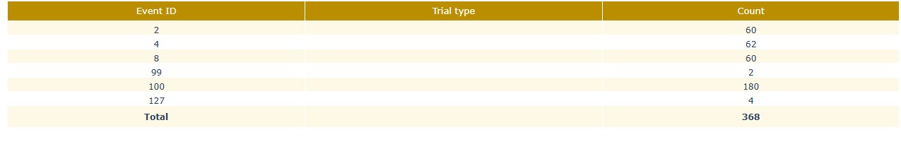
Stimulus Stim channel events: Each row is a physical stim channel and every column is a trigger ID. Each cell has the count of times every trigger appears. This should be consistent with the events summary table, but it can reveal additional information about the quality of the stimulus events. For example, if there are many events in the stim channel that do not appear in the BIDS events file, it may indicate that some events were missed during manual annotation. Conversely, if there are many events in the BIDS file that do not appear in the stim channel, it may indicate that some events were incorrectly annotated or that there were hardware issues during recording.

Stimulus BIDS events summary: The events summary table shows the count of each event ID and trial type (if available) for each run/task. This can help you to check whether the expected number of events are present and whether the trial types are correctly annotated.
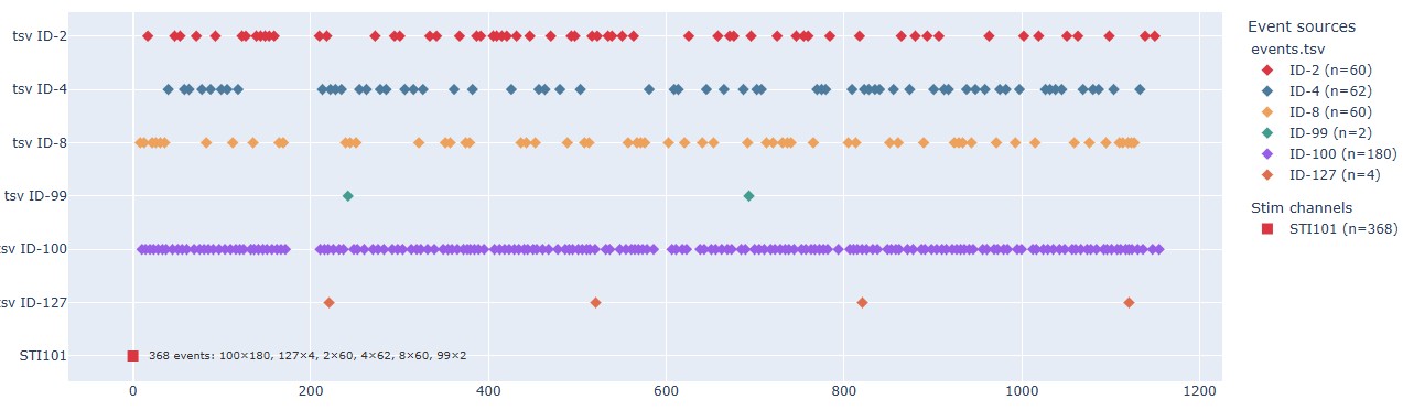
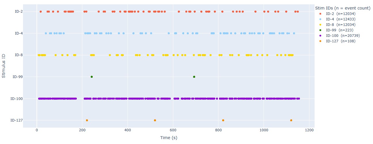
Stimulus Event timeline: This plot shows the timeline of events, with different colors representing different event IDs or trial types. This can help you to check the temporal distribution of events and identify any irregularities, such as missing events, unexpected event timings, or clustering of events. For the epoch calculation, if some events are too close to each other, they may be merged into a single epoch. This plot can help you to identify such cases and decide whether to adjust the epoching parameters or to manually inspect the events. The stimulus channel also appears, even though it’s not expressed in time, in this example is the red dot at the bottom of the plot.
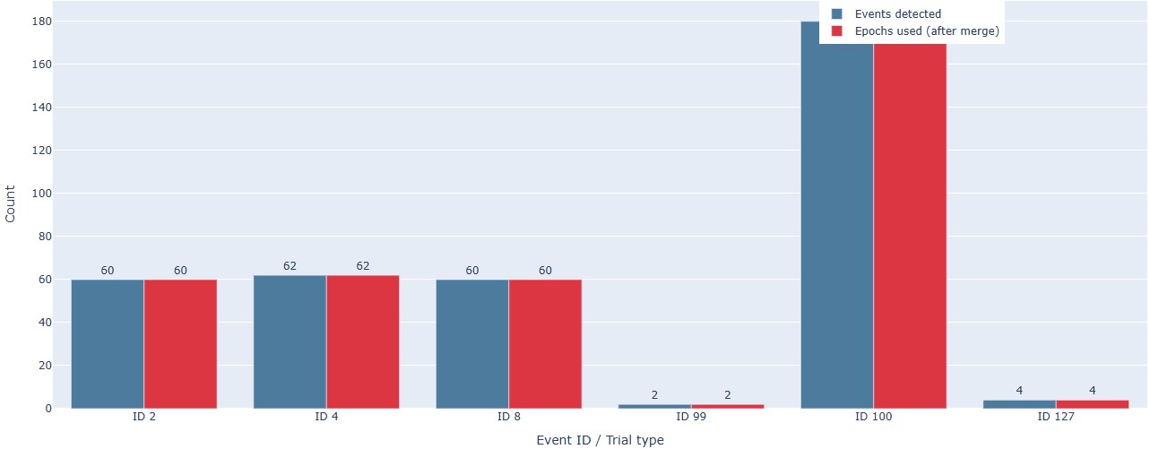
Count bar chart: This plot shows the count of each event ID or trial type for each run/task in a bar chart format. This can help you to quickly compare the number of events across runs and tasks, and identify any discrepancies or unexpected patterns.
Stimulus: It shows the timeline of events within the stimulus channel, with different colors representing different trigger IDs. This can help you to compare with the BIDS events timeline and check for consistency. It can also reveal any irregularities in the stimulus channel, such as missing triggers, unexpected trigger timings, or clustering of triggers. There is a subtab per stimulus channel, in case there are more than one.
QC summary tab#
Finally, the subject report includes a QC summary tab that provides a compact and metric-wise summary of the quality assessment results across each run and task. This tab is designed to support quick triage and decision-making by summarizing key findings from each metric in a concise format. It is divided in several subtabs:
Global Quality Index (GQI) subtab: * This subtab shows the GQI scores for each run and task, which are calculated based on the combination of different quality metrics and their thresholds. If you want to learn more about how the GQI is calculated, you can check the GQI documentation. The GQI provides an overall quality score that can help you to quickly assess the quality of each run and task, and to compare them across subjects or datasets.
PSD/ECG/EOG/STD/PtP/Muscle/Head/Stimulus subtabs: These subtabs provide a summary of the key findings from each metric, including quality issues that were identified in specific channels and epochs.